Nomad Field
A roaming campaign identity for an independent hospitality group, built around tactile field notes, warm photography and a flexible launch system.
Project Details
A campaign built for movement
Nomad Field needed an identity that could travel. The group opens two or three sites a year, each in a different building with a different character, and the previous system broke every time it met a room it was not designed for.
We built the work as a kit rather than a lockup: a modular grid for print and signage, a photographic direction that favours available light over styling, and a short set of rules covering the cases that actually cause trouble — small sizes, dark surfaces, and layouts with no clear margin.
The launch ran across print, wayfinding and a booking flow rebuilt around the same grid, so the identity holds together from the street sign to the confirmation email.
- Travel Between Buildings — One system that holds up in a Victorian warehouse and a new-build alike.
- Reduce Launch Time — Give the team a kit they can apply without a designer on every opening.
- Hold Together Online — Carry the same grid and tone through booking and post-stay email.
Early exploration
Sketches and wireframes
Nomad Field opens two or three sites a year, each in a different building with a different character. The identity they arrived with had been designed for a single room, and it broke every time it met a space it was not drawn for.
We handled the work end to end — audit, strategy, identity system, signage specification and the booking flow — so that the brand reads the same whether someone meets it on a street sign or in a confirmation email.

Working through the structure
Project results
We built the identity as a kit rather than a lockup, so each opening starts from a set of parts instead of a template to be broken.
- Modular Grid — One structure that scales from a business card to a building facade.
- Available Light — A photographic direction that favours real rooms over styled sets.
- Rules for the Edges — Guidance for small sizes, dark surfaces, and layouts with no margin.
The result is a brand the operations team can apply themselves, which is the difference between a system that survives three openings and one that survives thirty.
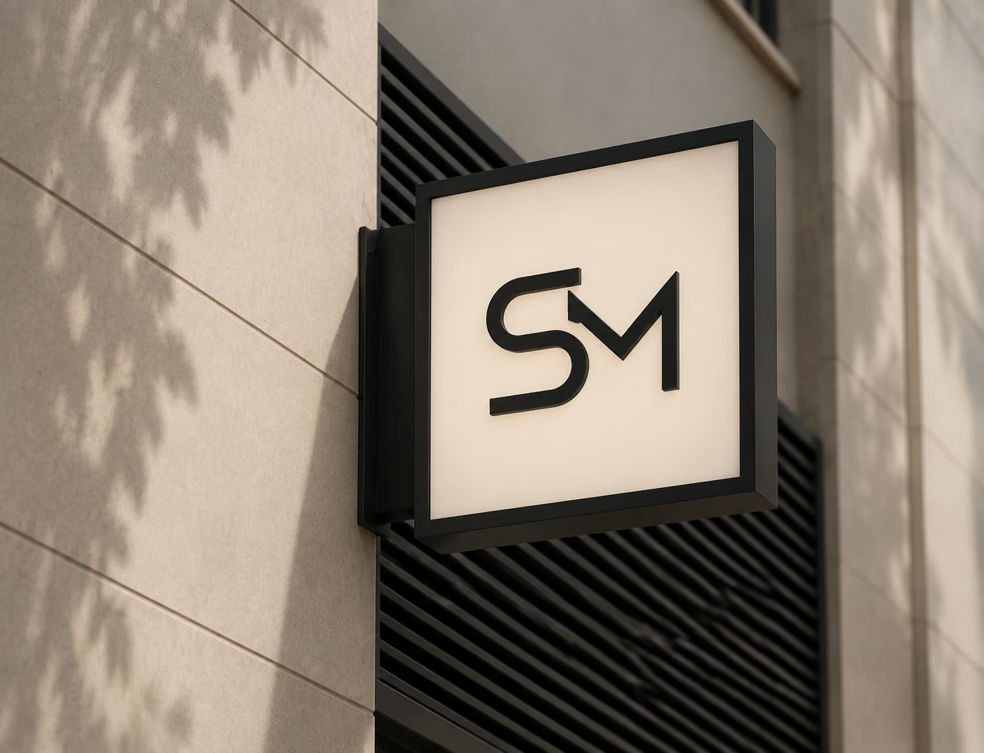
The finished system